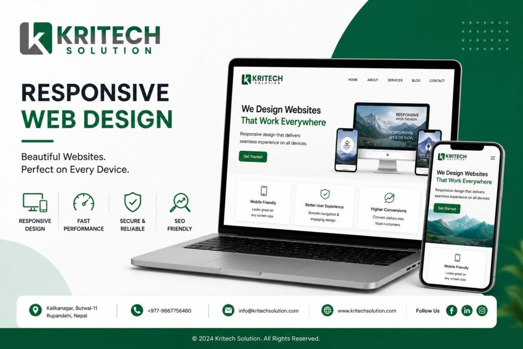
Responsive web design is no longer a feature you add to a website. It is the foundation every modern website must be built on from day one. If your website does not look and work perfectly on every screen size, you are losing visitors, damaging your brand credibility, and handing potential customers directly to competitors whose sites do work on mobile.
Nepal's internet users are overwhelmingly mobile-first. With smartphone penetration growing rapidly across urban and rural areas alike, the screen your next customer uses to find your business is almost certainly a phone. This guide breaks down exactly what responsive web design means, why it matters so deeply, and what to look for when choosing the right team to build your site.
What Is Responsive Web Design and Why Does Every Nepal Website Need It?
Responsive web design is a development approach where a website automatically adjusts its layout, images, and content to fit any screen size perfectly, whether that is a large desktop monitor, a tablet, or a small smartphone screen. Rather than building separate versions of a site for different devices, responsive web design uses flexible grids, fluid images, and smart CSS rules to deliver one seamless experience everywhere.
According to Statista's 2024 Global Digital Report, over 60% of all global web traffic now comes from mobile devices. In Nepal specifically, that figure is even higher given the dominance of smartphone usage over desktop browsing. A website without responsive web design is effectively broken for the majority of people trying to visit it.
7 Powerful Reasons Responsive Web Design Is Essential for Nepal Businesses
1. Mobile Users Are Your Biggest Audience Right Now
The reality of Nepal's digital landscape is clear. Most people searching for products, services, schools, or businesses are doing it on their phones. A website that fails to deliver a smooth mobile experience immediately loses those visitors to a competitor whose site works properly.
Professional responsive web design ensures every visitor gets a fast, clear, and frustration-free experience regardless of the device in their hand. Capturing mobile traffic is not optional for Nepal businesses in 2025. It is the primary battleground for online visibility.
2. Google Rewards Mobile-Friendly Websites With Higher Rankings
Google officially switched to mobile-first indexing, meaning it evaluates and ranks your website based on how it performs on mobile devices rather than desktop. A site built without responsive web design will rank lower in search results no matter how good its content is.
Professional responsive web design directly improves your SEO performance by satisfying Google's core mobile usability requirements. Every page of your site that works beautifully on mobile is a page that ranks higher, gets found more often, and drives more organic traffic to your business.
3. A Single Website That Works Perfectly Everywhere
Before responsive web design became the standard, businesses sometimes maintained separate desktop and mobile versions of their websites. That approach doubles the maintenance workload, creates content inconsistencies, and confuses search engines trying to index your pages.
Responsive web design solves all of that with one clean, unified codebase that adapts intelligently to every screen. One site to maintain, one set of content to update, one URL structure for search engines to crawl. Simplicity and performance working together in your favor.
4. Faster Load Times That Keep Visitors on Your Site
Page speed is one of the most critical factors in both search rankings and user experience. According to Google's Core Web Vitals research, 53% of mobile users abandon a website that takes longer than three seconds to load. Responsive web design built with performance in mind delivers fast load times across every device and every network condition.
For Nepal's varied connectivity landscape where users range from high-speed urban fiber to slower rural mobile networks, speed-optimized responsive web design is not just good practice. It is a direct revenue protection strategy.
5. Lower Bounce Rates and Longer Time on Site
When visitors land on a website that is difficult to navigate on their device, they leave immediately. That instant exit is recorded as a bounce and signals to Google that your page did not satisfy the searcher's intent, which damages your rankings over time.
Well-executed responsive web design creates intuitive navigation, readable text, and properly sized interactive elements on every screen. Visitors stay longer, explore more pages, and engage more deeply with your content. Every minute a visitor spends on your site moves them closer to becoming a customer.
6. Higher Conversion Rates Across Every Device
A beautifully designed responsive website does not just attract visitors. It converts them. Clear calls to action, properly sized buttons, easy-to-complete contact forms, and seamless checkout flows all depend on responsive web design being implemented thoughtfully and precisely.
HubSpot's research on website conversion optimization consistently shows that mobile-optimized websites convert at rates 2 to 3 times higher than non-responsive alternatives. Every element of responsive web design that makes your site easier to use on mobile directly increases the percentage of visitors who take the action you want them to take.
7. Future-Proof Design That Adapts to New Devices
Screen sizes and device types are constantly evolving. New smartphone models, tablets, foldable screens, and smart displays all present new viewing dimensions that a rigid fixed-width website cannot handle. Responsive web design is inherently future-proof because its flexible grid system adapts to screen dimensions that do not even exist yet.
Investing in professional responsive web design today means your website remains functional and visually strong as the device landscape continues to shift, protecting your investment for years rather than requiring a full rebuild every time new screen formats emerge.
What Does a Professional Responsive Web Design Project Include?
A complete responsive web design engagement covers discovery sessions to understand your business goals and audience, wireframing and layout planning for multiple screen sizes, custom visual design aligned with your brand identity, mobile-first development using clean and maintainable code, cross-browser and cross-device testing, page speed optimization, SEO-friendly site architecture, contact form and conversion element setup, content integration, and a structured handover with staff training on managing your new site.
Every layer of the responsive web design process has a direct impact on how your website performs in search, how visitors experience it across devices, and how effectively it converts that traffic into real business inquiries and sales.
Responsive Web Design vs Website Redesign: Do You Need Both?
If your existing website was built more than three years ago without a mobile-first approach, it almost certainly needs more than a visual refresh. A true responsive web design rebuild addresses the underlying code structure, navigation architecture, and performance foundations that a surface-level redesign cannot fix.
Many Nepal businesses discover that their current site's poor mobile performance is the single biggest factor limiting their organic search rankings and online lead generation. A professional responsive web design rebuild fixes the root cause rather than painting over the problem, delivering results that a simple visual update never could.
Why Kritech Solution Builds Responsive Web Design That Performs
Kritech Solution is a Nepal-based IT and digital services company with deep expertise in building responsive web design solutions for businesses across every major industry. Their development team combines technical precision with conversion-focused design thinking to create websites that look exceptional and perform powerfully on every device.
What makes Kritech Solution the right responsive web design partner is their integrated approach. Your website is not built in isolation. It is designed with your SEO strategy, your brand identity, your content plan, and your conversion goals all working together from the very first wireframe. The result is a website that does not just exist online but actively grows your business.
From straightforward business websites to complex multi-page platforms, Kritech Solution delivers responsive web design that Nepal businesses can be genuinely proud of and that their customers find easy, fast, and compelling to use.
Frequently Asked Questions
What is responsive web design and why does my Nepal business website need it? Responsive web design is a development approach that makes your website automatically adjust to look and function perfectly on any screen size, from desktop monitors to smartphones. Every Nepal business website needs it because the majority of your visitors are browsing on mobile devices, Google ranks mobile-friendly sites higher, and a poor mobile experience directly costs you customers and revenue every single day.
How do I know if my current website has responsive web design? The simplest test is to open your website on your smartphone and check whether the text is readable without zooming, buttons are easy to tap, and navigation works smoothly. You can also use Google's free Mobile-Friendly Test tool to get an instant assessment of whether your site meets responsive web design standards and where the specific issues are.
How long does a responsive web design project take with Kritech Solution? A standard responsive web design project with Kritech Solution typically takes 3 to 6 weeks depending on the size of the site, the complexity of the design, and the amount of content to integrate. Their team provides a clear project timeline during the initial consultation so you always know exactly what to expect at every stage of the process.
Will a responsive web design rebuild improve my Google rankings? Yes, significantly. Since Google uses mobile-first indexing, a professionally built responsive web design directly improves your mobile usability scores, page speed metrics, and overall search rankings. Most businesses see measurable improvements in organic search visibility within 4 to 8 weeks of launching a properly optimized responsive web design rebuild.
Can Kritech Solution redesign my existing website with responsive web design without losing my current content? Absolutely. Kritech Solution carefully migrates all existing content, images, and page structures during a responsive web design rebuild, ensuring nothing valuable is lost in the transition. They also implement proper redirects and technical SEO measures to protect your existing search rankings throughout the entire redesign and launch process.
Your Website Is Either Working for You or Against You
Every day your business runs on a website that does not meet responsive web design standards is a day you are losing mobile visitors, ranking lower on Google, and converting fewer of the people who do find you. In Nepal's rapidly mobilizing digital market, a properly built website is not a nice-to-have. It is your most important sales tool.
Kritech Solution is ready to build a responsive web design solution that makes your business look brilliant and perform powerfully on every device your customers use. Reach out today for a free website audit and discover exactly what a professionally built responsive website can do for your visibility, credibility, and growth in 2025.
Contact Information
Kritech Solution
📍 Butwal-11, Kalikanagar
📞 9867756460
📧 info@kritechsolution.com
🌐 www.kritechsolution.com