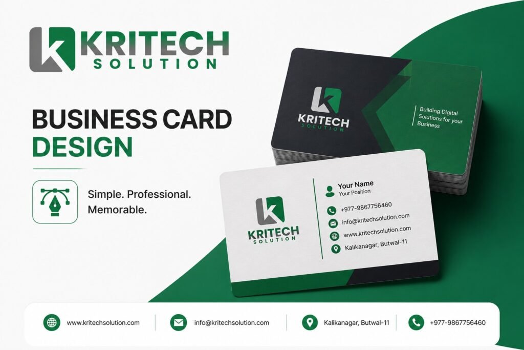
Your business card design is doing more talking than you think. The moment you hand someone that small rectangle of card, they are already forming an opinion about you, your brand, and whether they want to do business with you.
That is a lot of pressure for something the size of your palm.
But here is the exciting part. A well-designed business card is one of the most cost-effective, high-impact branding tools available to any business, big or small. Physical business cards demonstrate a 12% conversion rate, which is significantly higher than the average website conversion rate of around 2.35%. That number alone should make every business owner sit up and pay attention.
In this guide, we are going to walk through everything you need to know about creating a business card that people actually keep, remember, and act on.
Why Business Card Design Still Matters in a Digital World
Some people assume that in an age of LinkedIn profiles and digital contact apps, business cards have gone the way of fax machines. That assumption is costing those businesses real opportunities.
A well-designed business card remains one of the most powerful tools for creating a memorable first impression and establishing credibility. Nothing digital quite replaces the experience of handing someone something tangible. The physical exchange creates a moment of personal connection that an email notification simply cannot replicate.
Think about the last time someone handed you a card that genuinely impressed you. You probably still remember what it looked like. That is the power of great business card design at work.
Nearly 39% of people say they will not do business with someone if they have a cheap-looking business card. Your card is not just contact information. It is a trust signal. It is a preview of the quality and professionalism you bring to everything you do. Wave
The Core Elements Every Great Business Card Design Needs
Getting business card design right is part art and part strategy. There are certain foundational elements that separate forgettable cards from ones that get tucked into wallets and pulled out at just the right moment.
Clear, Readable Typography
Your font choices communicate personality before a single word is read. Clean, modern typefaces signal professionalism and confidence. Overly decorative or tiny fonts signal confusion and carelessness.
A good rule of thumb is to use no more than two font families on a single card. One for your name and company, one for your contact details. Keep your body text at a minimum of 8pt so it is actually legible without a magnifying glass.
Hierarchy matters enormously here. Your name should be the dominant element, followed by your title, then your contact information. Guide the reader's eye naturally through the card rather than making them hunt for what they need.
A Color Palette That Reflects Your Brand
Colors carry emotional weight. Blue instills trust while red energizes, and harmonious color palettes create visual appeal that reinforces brand recall. Choosing colors that align with your existing brand identity is not just about aesthetics. It is about creating a consistent, recognizable brand experience across every touchpoint.
If your website and marketing materials are clean navy and white, your business card should carry that same palette. Introducing a completely different color scheme on your card sends a confusing message about your brand identity.
Resist the temptation to use every color in the rainbow. Two to three colors used consistently and intentionally will always outperform a card that tries to do too much.
Strategic Logo Placement
Your logo is the face of your brand. It deserves a prominent, intentional placement on your card rather than being crammed into a corner as an afterthought.
A clean, well-placed logo catches attention and immediately communicates your brand identity. Consider giving your logo room to breathe with sufficient white space around it. A logo that is fighting for attention against overcrowded text loses its power entirely.
The front of the card is typically the place for your logo, name, and title. The back is a great space for contact details, a tagline, or even a QR code that links to your portfolio or website.
White Space: The Underrated Design Element
Amateur designers fill every inch of available space. Professional designers know that white space is not wasted space. It is breathing room that makes your key information stand out and gives the card an overall feeling of quality and confidence.
Cards that are cluttered and dense feel overwhelming and cheap. Cards with generous white space feel premium and intentional, even before the reader has processed a single piece of information.
Top Business Card Design Trends Shaping 2025
The world of business card design is not static. Trends evolve, materials improve, and printing technology opens up new creative possibilities every year. Staying current with what works gives your card an edge.
Minimalism Is Still Winning
The latest trends in business card design lean strongly toward minimalism, with slim and clean layouts being particularly popular. Less information, more impact. A minimal card forces you to be disciplined about what you include, which typically results in a more memorable and effective design.
This does not mean boring. Minimalism done well uses beautiful paper stock, a thoughtful color choice, and precise typography to create something that feels luxurious in its simplicity.
Premium Materials and Finishes
Businesses are increasingly choosing advanced options like specialty finishes including foil stamping and embossing, along with premium paper stocks, to create high-quality and distinctive business cards. The material your card is printed on sends a message every bit as loud as the design itself.
Matte finishes feel sophisticated and modern. Glossy finishes feel bold and vibrant. Soft-touch lamination creates a velvety texture that people genuinely comment on. Foil accents on your logo or name add a premium shimmer that is hard to ignore.
These upgrades are not extravagant luxuries. They are smart brand investments that make your card the one that gets remembered and kept rather than tossed.
Rounded Corners and Unique Shapes
Rounded corners on a business card are a small detail that creates an outsized impression of modernity and care. Rounded edges offer a modern aesthetic that immediately differentiates a card from the standard straight-cut alternatives.
Die-cut shapes that reflect your industry or logo can take this even further. A photographer whose card is shaped like a camera lens. An architect whose card is cut in the profile of a building. These kinds of details transform a card from a contact exchange into a conversation piece.
QR Codes and Digital Integration
Adding a QR code to your business card that links directly to your portfolio, website, or LinkedIn profile bridges the physical and digital worlds beautifully. It gives the recipient an immediate, frictionless way to learn more about you.
The key is to make the QR code purposeful rather than decorative. Link it to something genuinely useful, like a special landing page, a video introduction, or your best work showcase. A QR code that just goes to a generic homepage is a missed opportunity.
Common Business Card Design Mistakes You Need to Avoid
Even well-intentioned business cards can fall flat because of a few avoidable errors. Being aware of these pitfalls before you design saves you time, money, and missed first impressions.
Overloading the Card With Information
Your business card is not your resume. It is a conversation starter and a reference tool. Include your name, title, company name, phone number, email, website, and perhaps one social handle. That is it.
Every additional piece of information you add competes with the essential details and reduces the overall clarity of the card. Trust that if someone wants to know more, your website and social profiles will do the rest of the work.
Using Low-Resolution Logos or Images
A pixelated logo on a printed business card design is one of the most damaging things you can do to your brand perception. Always use vector files (AI, EPS, or SVG) for your logo so it scales perfectly to any size without losing quality.
If your designer asks for a high-resolution version of your logo and you cannot provide one, that is a separate problem worth fixing before you print a single card.
Ignoring Print Bleed and Safe Zones
This is a technical detail that many people overlook until they receive their printed cards and find important text or design elements are cut off at the edges. Every professional card design needs a 3mm bleed area around the edges and a safe zone that keeps critical content away from the trim line.
Working with a professional design team like Kritech Solution means these technical details are handled correctly from the start, saving you from reprinting costs and the frustration of imperfect results.
Choosing Style Over Legibility
A creative font might look stunning on screen but become completely unreadable when printed small. Always proof your card design at actual print size before finalizing. If you struggle to read your own phone number, your potential clients will too.
Legibility is not a compromise on creativity. It is the foundation that makes your creative choices actually work.
How to Brief a Designer for Your Business Card Design
Getting a great result from a business card design project starts with a clear brief. The more context you give your designer, the better the outcome will be.
Start by sharing your existing brand assets. Your logo files, brand color codes (in HEX or CMYK), and any existing marketing materials give the designer the building blocks they need. If you do not have these yet, a good designer can help you establish them.
Describe your target audience and what impression you want to make. A financial services firm wants to feel trustworthy and established. A creative studio wants to feel innovative and expressive. These are very different visual directions that require a clear brief to get right.
Share examples of cards you admire and, just as importantly, cards you do not like. Giving your designer a sense of your taste through reference points dramatically reduces the number of revision rounds and gets you to a result you love much faster.
According to Canva's design research, providing specific feedback with clear reasoning rather than vague comments like "make it pop" leads to dramatically better design outcomes and shorter project timelines. Specificity is kindness when briefing a creative professional.
What Makes Business Card Design Different in the Nepal Market
Nepal's business culture places enormous value on personal relationships and face-to-face networking. Business cards are exchanged frequently at meetings, trade events, and networking gatherings across Kathmandu, Butwal, Pokhara, and beyond.
This makes the quality of your business card design particularly significant in the local context. Handing someone a well-crafted, professionally designed card in a meeting in Nepal signals that you take your business seriously and that you respect the relationship being formed.
Bilingual cards that include both English and Nepali text are increasingly common among businesses that serve both local and international clients. This thoughtful touch demonstrates cultural awareness and makes your card accessible to a broader audience.
According to Forbes on brand consistency, consistent visual branding across all materials, including business cards, increases revenue by up to 23% on average. That statistic holds just as true in Nepal's growing business ecosystem as it does anywhere else in the world.
Designing for Both Print and Digital: The Modern Approach
Today's smartest business card strategies think beyond the physical card alone. Your design should translate beautifully across both print and digital formats.
A digital business card that mirrors your physical design gives you a shareable version you can send via WhatsApp, email, or messaging apps. This is particularly useful when you meet someone virtually or when you have run out of physical cards at an event.
Ensuring your design looks equally sharp on screen and in print requires working with a designer who understands both mediums. Color profiles differ between print (CMYK) and screen (RGB), and a card that looks vibrant on your monitor but prints dull is a common problem when this detail is not managed properly.
The business card design market is projected to grow by 8.81% between 2025 and 2033, driven largely by innovative formats and the integration of digital functionalities. Getting your business card design strategy right now positions your brand perfectly for this growing landscape.
Frequently Asked Questions About Business Card Design
What information should I include on my business card design?
Your business card design should include your full name, job title, company name, phone number, email address, and website URL. You can also add one or two social media handles if they are relevant to your professional presence. Keep it focused and avoid overloading the card with unnecessary details that distract from the essentials.
What size should a standard business card design be?
The standard business card design size is 3.5 inches by 2 inches (approximately 89mm x 51mm). This size fits easily into wallets and cardholders and is universally recognized. If you want to stand out, slightly different proportions or square formats are options, but keep in mind that non-standard sizes can sometimes be harder to store and carry.
How many colors should I use in my business card design?
Two to three colors is the sweet spot for most business card designs. Using your existing brand colors ensures consistency across all your marketing materials. Too many colors make a card feel chaotic and unpolished, while a limited, intentional palette communicates confidence and professionalism.
Should I use both sides of my business card design?
Yes, using both sides of your card is a smart move. The front should feature your logo, name, and title as the dominant elements. The back is ideal for your contact details, a tagline, a QR code, or a visual element that reinforces your brand. Using both sides doubles your design real estate without increasing the card size.
How do I choose the right paper stock for my business card designs?
Paper stock choice depends on the impression you want to create. A heavier cardstock (350gsm and above) feels premium and substantial in the hand. Matte finishes feel sophisticated and allow for easy writing. Glossy finishes make colors pop. Soft-touch lamination feels luxurious. Your designer and printer can show you samples to help you choose the right option for your brand and budget.
Get a Business Card Design That Actually Works for Your Brand
Your business card is working for your brand every time it leaves your hand. It deserves the same level of thought and investment you give to any other part of your marketing.
At Kritech Solution, we design business cards that do more than look great. We design cards that communicate the right message about your brand, make the right first impression on your prospects, and hold up beautifully in print. Whether you are a freelancer, a startup, or an established business in Nepal, we have the design expertise to create something you will be proud to hand out.
Stop giving people a reason to doubt your professionalism. Let us design a business card that gives them every reason to trust you. Reach out to Kritech Solution today and let us get started.
Contact Information
Kritech Solution
📍 Butwal-11, Kalikanagar
📞 9867756460
📧 info@kritechsolution.com
🌐 www.kritechsolution.com